The Upendo Judo Club brand is built around key principles that align with the spirit of Judo:
The visual identity incorporates traditional Judo elements with a modern and impactful design that resonates with both Tanzanian culture and the international Judo community.
The club’s logo features:
"Your Way of Life" – This phrase encapsulates the essence of Judo as a lifelong practice that extends beyond the mat into everyday life.
As the branding project develops, we are focusing on:
We are currently in the development phase, fine-tuning the brand identity and preparing for the club’s official launch. Our goal is to create a strong and recognizable presence that will inspire new generations of judokas in Tanzania.
The TICGL brand embodies:
The brand visually represents these principles with a bold and professional design that conveys credibility and success.
The TICGL logo is designed to be both recognizable and symbolic:
"Your Gateway to Business Success in Tanzania" – Highlighting the company’s role in guiding businesses toward sustainable growth in the region.
Our branding strategy includes:


To maintain a professional and modern look, the logo adaptation will focus on:
A fully optimized website will be developed to showcase Oxford MS Language Centre’s programs and services effectively. Key features include:
Homepage – Engaging introduction with a clear call-to-action.
Courses & Language Offerings – Detailed descriptions of available courses.
Online Booking – A user-friendly interface for inquiries and registrations.
Blog & Resources – Articles on language learning, cultural exchange.
Contact & Location – Easy access to contact information and center location.
SEO Optimization & Mobile Responsiveness – Ensuring high visibility on search engines and seamless access from any device.
To engage and educate the audience, a content strategy will be developed, including:
Web Copywriting – Clear and persuasive text to highlight the center’s strengths.
Blog Articles – Language learning strategies, benefits of multilingualism, and cultural insights.


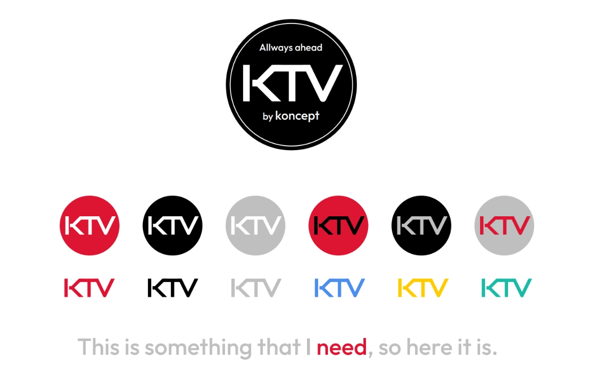
The rebranding aimed to transform Koncept Tanzania’s identity into a bold, professional, and innovative brand that could stand out in the competitive marketing and digital media landscape.
Logo & Typography – The refined "K" icon presents a minimalist yet strong symbol of creativity and communication. A modern, sleek typeface reinforces professionalism and contemporary branding.
Color Palette – The orange, black, and white combination conveys energy, confidence, and authority, aligning with the company’s role in marketing and digital strategy.
Visual System – A structured and scalable branding system, adaptable across print, digital, and multimedia platforms.
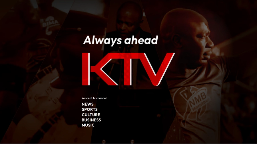
As part of the digital branding, a homepage concept was designed to reflect the company’s expertise in marketing, branding, and content creation, while also integrating its YouTube channel as a core business asset.
Impactful hero section with strong messaging to establish authority.
Service highlights, showcasing expertise in marketing, branding, and digital strategy.
Dedicated YouTube section, reinforcing the company’s presence in digital media.
Clean and modern UI, ensuring a seamless user experience across devices.
Although the website was not developed beyond the conceptual phase, the proposal demonstrated a clear and strategic approach to enhancing Koncept Tanzania’s digital presence.


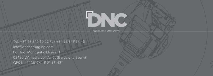
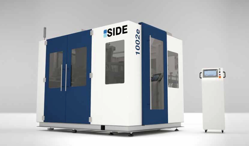
This project successfully transformed DNC Packaging Machinery’s brand into a modern, professional, and highly recognizable industry leader, leveraging both branding expertise and cutting-edge digital visualization.
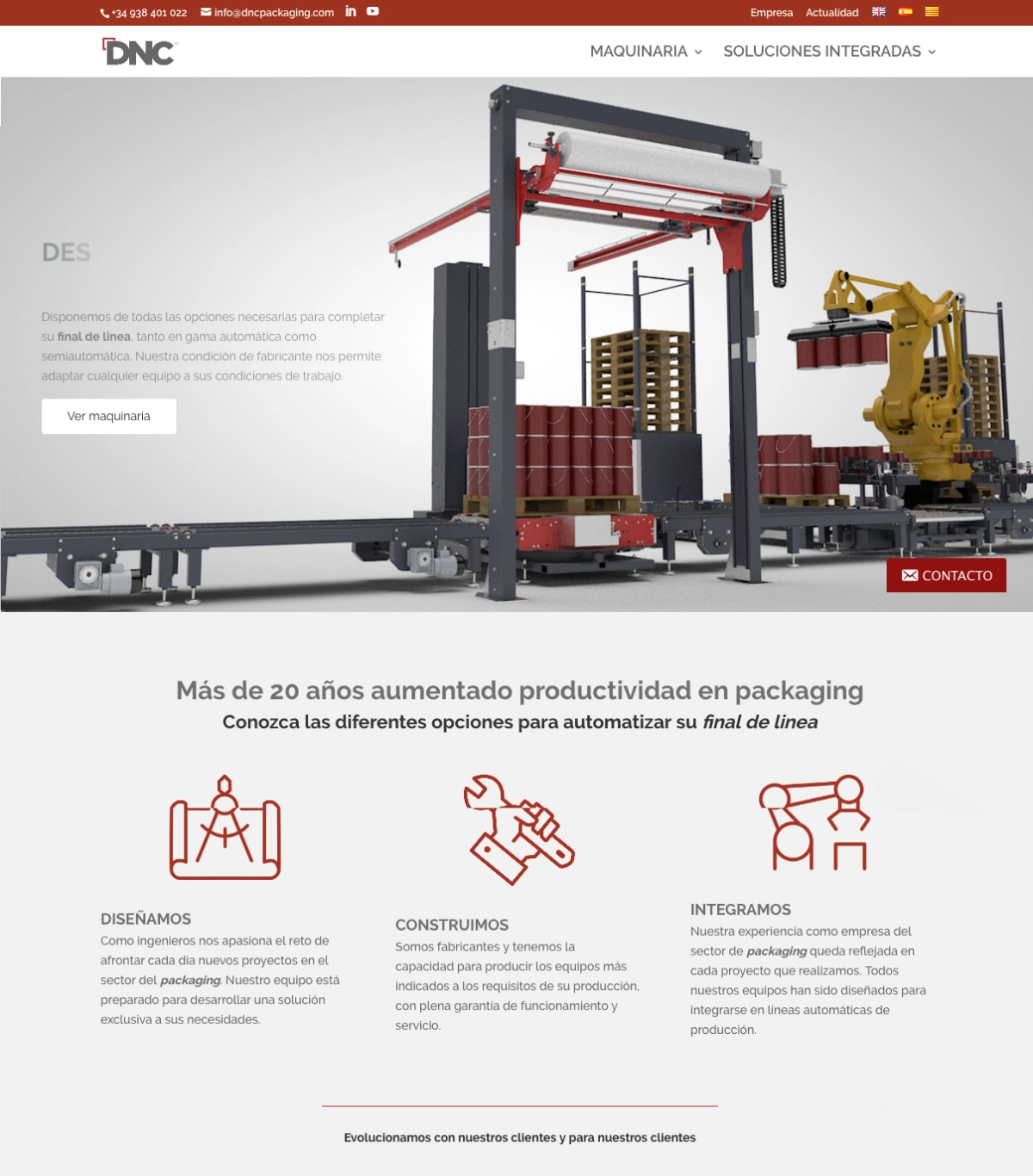

Corporate Image Redesign – Updated all branding materials while keeping the existing logo.
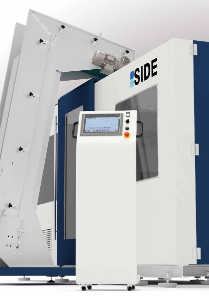
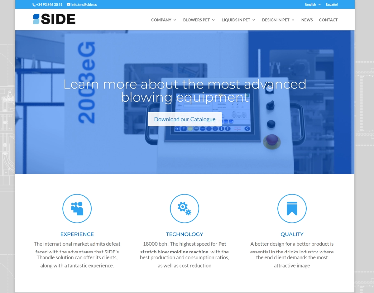
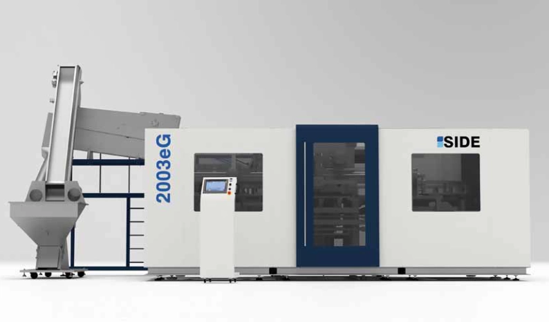
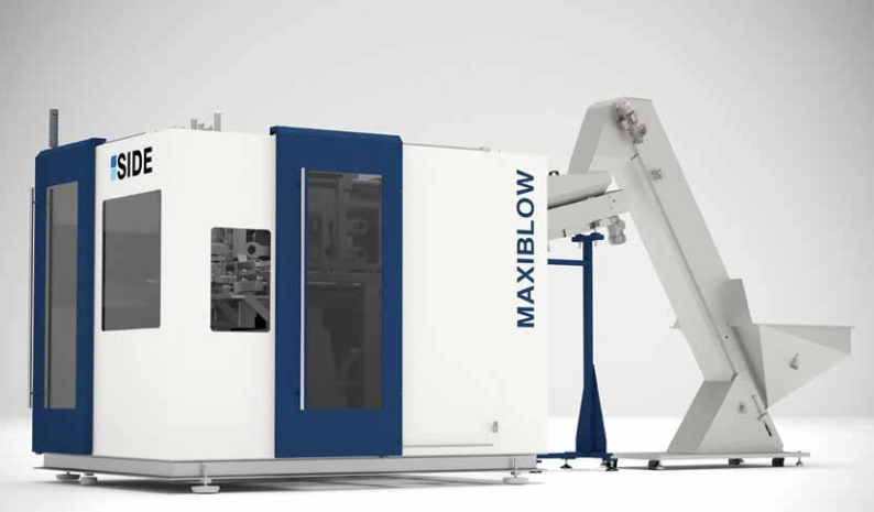
This project successfully transformed SIDE’s corporate image, providing a modern, industry-leading identity that aligns with its technological excellence and global market reach.
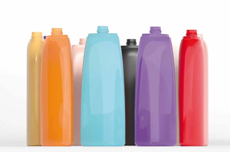
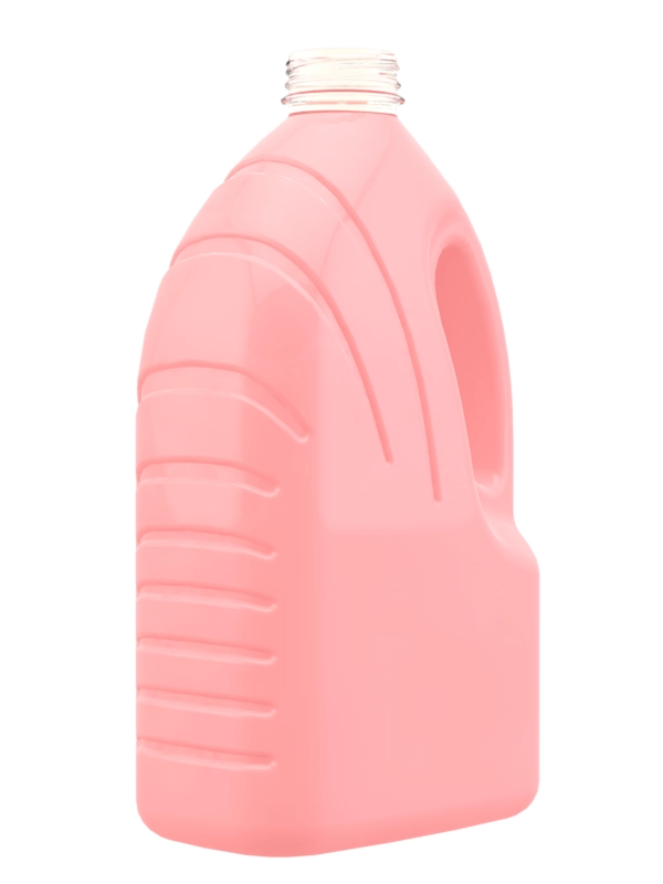
This project successfully brought a new bottle concept to life, blending aesthetic appeal, functional design, and cutting-edge visualization to support product launch and commercialization.

Although the project was ultimately not realized due to external factors, it remains an excellent example of how design can be adapted across industries, from corporate and industrial sectors to education and international training initiatives.


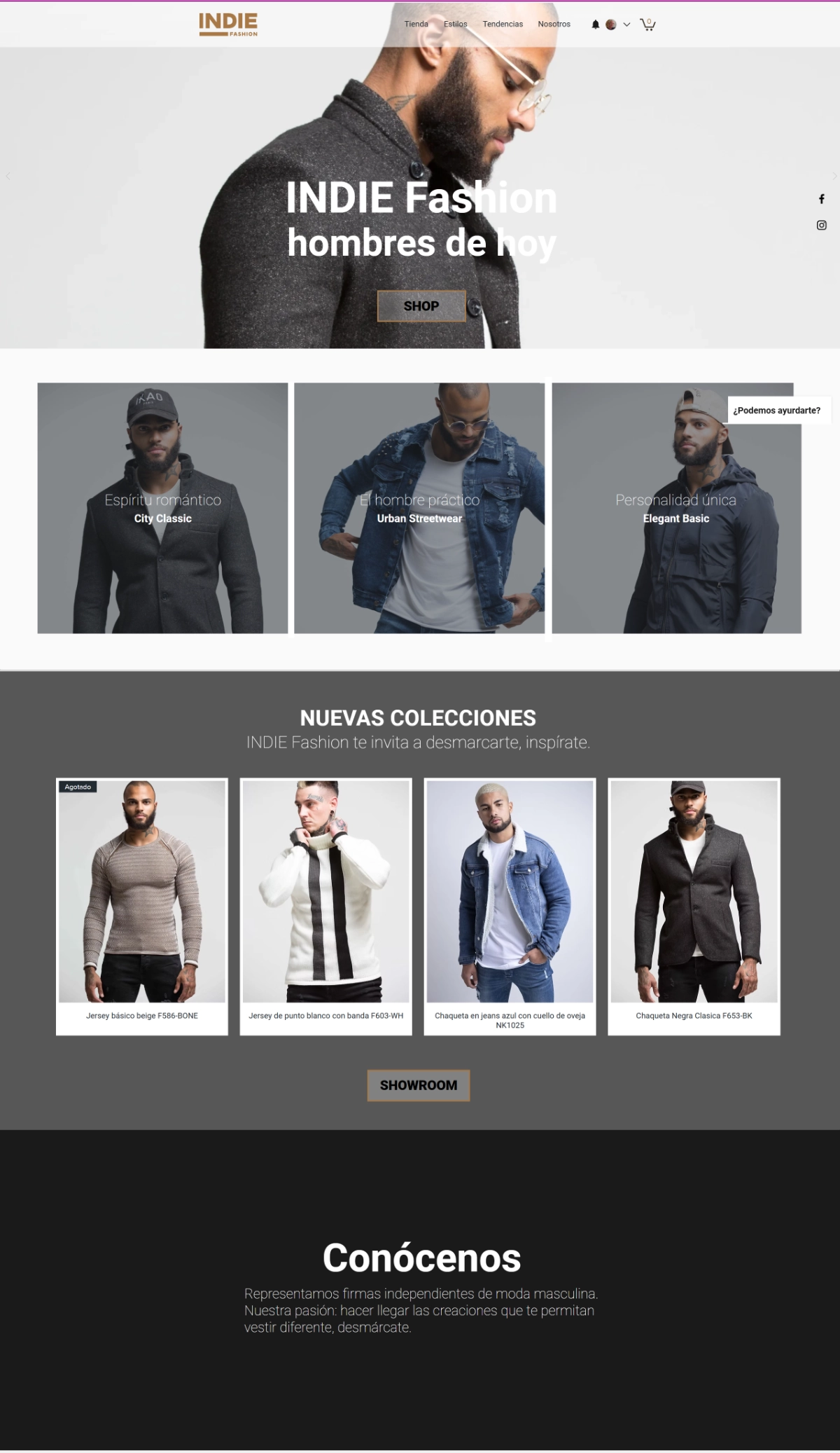
Clean & Sophisticated Layout – The neutral color palette (beige, black, and white) conveys elegance, modernity, and masculinity, making the brand feel premium yet approachable.
Strong Visual Hierarchy – The design effectively prioritizes imagery, allowing the clothing collections to be the focal point. This aligns well with high-end and minimalist fashion e-commerce strategies.
User-Friendly Navigation – The well-structured homepage guides the user through:
Seamless E-commerce Integration – The product grid with clear pricing and descriptions ensures that customers can quickly browse and make purchasing decisions, maintaining an intuitive shopping experience.
Mission: To lead projects that enhance creativity, communication, and learning by integrating technology, strategic thinking, and industry insights, ensuring sustainable business growth and community development.
Vision: To drive impactful storytelling and digital innovation that bridges talent with industry demands, empowering communities and fostering economic growth.